Responsive Website Design: Why It’s Crucial for Your Business Success
Responsive web design is no longer an option in the world of internet reliance but a necessity. As an entrepreneur, you already know that responsiveness in the user interface and user navigation will greatly enhance user experience, bring more conversions, and eventually reach business success. Why is responsive design so important? The blog will discuss what a responsive website design is, why it is important to your business, and how you can achieve this with proper strategy and partnership.
What Is Responsive Website Design?
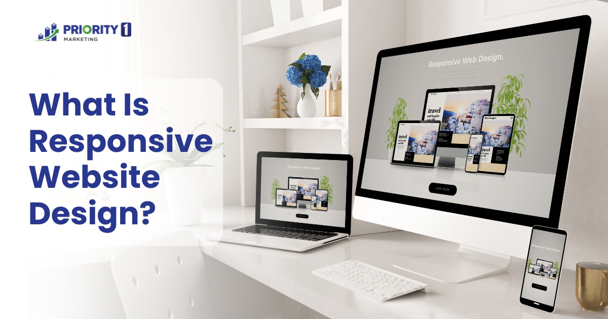
Responsive website design is an approach where the layout of a site adjusts fluidly across various screen sizes and devices. It simply means that be it your mobile phone, a tablet, a laptop, or a desktop, your user will find an optimised version of your site.
These days, consumers will keep on expecting seamless experiences. Your brand’s credibility and credibility are going to heavily rely on website designing which respond.
The Growing Need for Responsive Website Design
The improvement of mobile devices puts much demand on responsive website design as it asks businesses to be responsive as their online presence.
Importance of Mobile Users
Since today’s most users rely upon their smartphones to connect to the internet, companies are primarily small ones that must take up the need for the same in the small business website design which ensures it has a smooth experience in all devices. Responsive design is not just an experience but also influences SEO.
Aspect of Search Engine Optimisation
In Australia, Google ranking algorithms give preference to mobile-friendly website designing. A responsive site may be that which brings more visibility to your website in search results. Businesses, for keeping themselves on par with competitors, require responsive design to reach and engage and retain their customers through mobile, tablet, or desktop platforms.
How Responsive Design Impacts Business Success
Responsive design is very crucial to the success of business because it makes the experience of the whole website great.
1. Enhancing User Experience
If a website is good and accessible as well through any device, then the visitors will tend to stay and explore more and interact with the content of the website, and that leads to high engagement metrics and a better relationship with the users. The bounce rates will decrease because of the frictionless responsive design. People will not scroll past too much content, but they’ll spend more time on the page.
2. Increasing Engagement and Retention
This user experience will also create customer loyalty as users will remember the smooth interaction with professionalism and return more likely. This might work out into better brand reputation and higher conversions for businesses. In a digitally-first world, responsive website design must be the first point of focus for connecting audiences, expansion bases of customers, and keeping in business long-term.
Critical Components of Responsive Website Design
Important aspects for responsive website design are important components necessary to offer peak functionality in all devices.
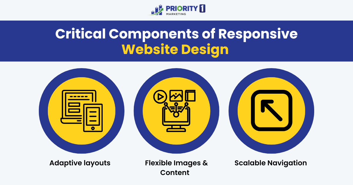
Adaptive layouts
This primary aspect actually change and scale the structure according to the screen size of the user’s view device by using CSS media queries.
Flexible Images and Content
These two go together because it needs to be scaled fluidly so that it doesn’t lessen the quality or push elements out of place when seen on smaller screens; rather, the experience of a user should be much the same when viewed on other devices.
Scalable Navigation
Mobile-friendly hamburger menus, enable intuitive navigation without the need for over-scrolling or over-crowding. The user will always be able to find whatever they need easily and within a quick amount of time without cluttering their screen or scrolling beyond what’s necessary.
Altogether, these elements make a responsive design more accessible and more user-friendly. Great results from such features, amongst others, are increasing user satisfaction and keeping visitors on board no matter which device they are using.
How to Design a Website for A Small Business
To a new web designer and small business owner, this can seem like a huge task. But with only a few easy steps, though, the whole process can be simplified and easy to follow.
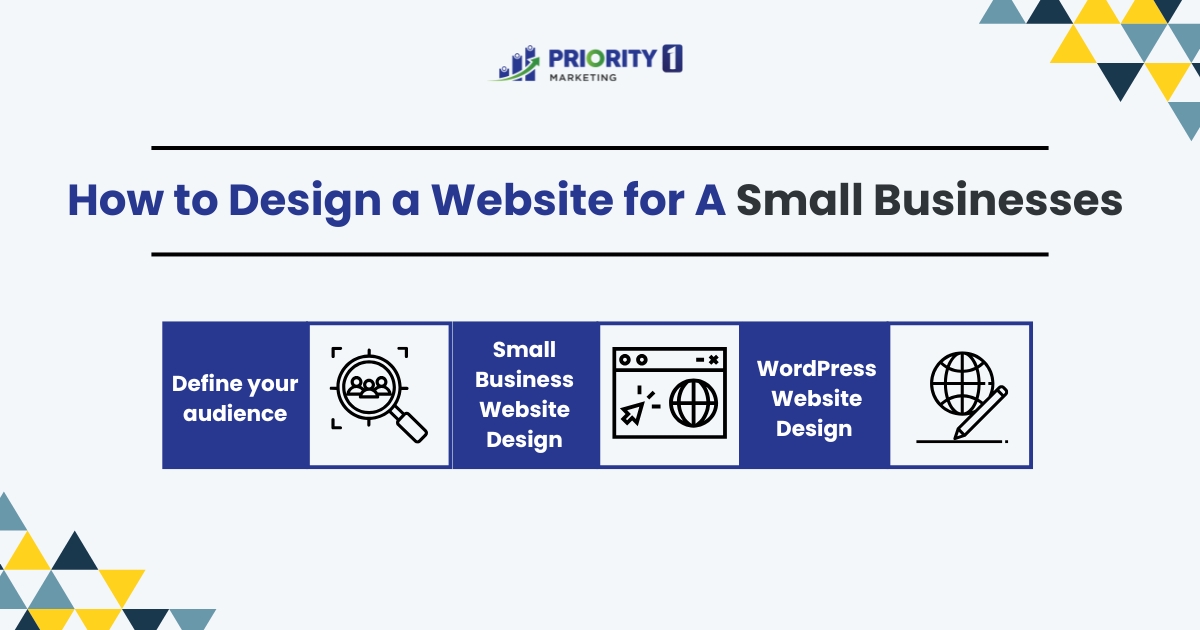
Define your audience
Having an idea of your website’s visitors will keep the responsive features aligned for what they need. And since most users use mobile devices, responsiveness to the layout and navigation of your website is important.
Small Business Website Design
The added advantage of this would be to interact with an experienced small business website design agency. Having professionals around would give surety over smooth responsive design layouts. This is very likely that your small business would give the first, major impression due to this flexibility in screen size compatibility through cross-device access.
WordPress Website Design
One website design which is best and easy to use is WordPress. It can be used as a design for your web creation. With this WordPress website design, you can gain versatility and ease of use for your small businesses. You will be able to look after your site as per your desire without so many technical requirements. Using numerous responsive themes coupled with the plethora of WordPress plugins might make your affordable yet scalable website look gorgeous while being on any device. This will create an effect and giving more access for small businesses.
Why Small Business Needs Responsive Design
Responsive design will let small businesses compete in a new mobile-centric marketplace.
Consumer Expectations in Australia
The Australian consumer increasingly expects the same seamless experiences of every single business, large or small. A responsive website design will allow users to easily access and traverse your site using a smartphone, tablet, or a desktop-it’s essential for attracting and gaining the confidence of customers.
Competitive Edge
Responsive sites rank better in search engines, meaning it is easier for a potential customer to find your business online. This therefore translates to a better level of visibility and an increased range of the target audience without driving away potential customers due to the worst form of mobile usability. More fundamentally, responsive design does respond to the needs and wants of consumers by making their digital business even more believable. Therefore, responsive design gives small businesses digital success.
The Role of Responsive Design in SEO
Visibility Enhancement
Giving your website more visibility and credibility within the search engine gives a website with the potential of giving the same user experience on any device greater chances to rank better online. That means a responsive design would make your website rank better and be easily found.
Google’s Mobile-First Indexing and Your Site’s Ranking
Responsive design is more cost-effective, giving it an edge on being indexed in mobile first by Google. This generates an increased number of organic traffic without the need for adding new marketing costs. It even reduces bounce rates as friendly to users, which positive user engagement search engines embrace. Responsive design thus forms the nucleus for making optimal performance of your website attract and retain the visitors to enable you to improve your online presence in all aspects.
How to Make a Website with Responsive Design and Accessibility
Importance of Specific Website Design
Responsive design is thus especially useful in making an available website: that means the use of it shall inevitably be by everyone with disabled access. This is especially helpful for an Australian business, whether it is any specific website design or otherwise, because it expands the viewable audience and meets one of the largest criteria when it comes to accessibility on websites. Several of these features include the use of scalable text, keyboard-navigable pages, and adapted layouts, exactly what responsive design principles allow for.
Benefits for a Broader Audience
A responsive and accessible website that caters to the diversity and flexibility of users demands a mobile-first approach. You should, therefore, focus on the mobile layout and functionality first and then scale up for larger screens. And here’s why: most traffic comes from mobile devices. Let flexible grids and media queries enable your content and layout to flow with or without interruption according to screen size.
The site should be WCAG compliant for better access to the users with disabilities to navigate and interact with the site. Features like alt text for images, keyboard navigability, and colour contrast should ensure readability, and clear headings and labels help screen readers in interpreting the content better, which would make it easier for the visually impaired.
Simple by picking a content management system, such as WordPress, that will include responsive and accessible themes. Together, these best practices produce an intuitive site, inclusive and ready for any device or user need.
User Experience (UX) and Association with Responsive Design
It is related to user experience or UX, since they work together to produce optimum interaction for the user.

Why UX Matters in Modern Website Designing
If the website is not optimised for different devices as interfaces, its users on a mobile or tablet would most probably encounter problems such as problems in navigation, distorted layouts, or slow loading leading to frustration and high bounce rates. Responsive design clears all these obstacles by giving responsive content and layout. This way, it gets more usable for any size of screen it is rendered on.
How UX Impacts Conversion Rates
Today, in the speed of the digital world with users demanding speedy, effortless experience, a good UX leads to higher engagement rates, increases conversion rates, and customer loyalty.
Responsive design is also conducive to accessibility, which makes user interaction with the content simpler for people having different requirements. With responsive design in line with UX, businesses will thus be able to attract a new visitor base but still retain these visitors, as it is the long-term relationships with users that shall give businesses a much-needed competitive advantage within a digital marketplace.
Common Challenges in Responsive Website Design
A responsive website experience requires great expertise in handling and overcoming a wide range of responsive design challenges, including those for companies that are ignorant of responsive design.
Addressing Compatibility Issues
One of the most common issues is compatibility: it’s hard to ensure a site render right in various browsers and different devices. Inconsistency in user experiences may arise because of variations in screen size, resolution, and different browser capabilities.
Managing Load Speeds
Load times is another prime factor. Huge images and wide-ranging animations make mobile loading speeds slow, which has the negative effect on user engagement and SEO. These factors need to be optimised by developers in such a way that balance is created between the aspect of look and feel with the performance. It is also hard to design the structure of the site so that it can be easily navigated through on any device.
So, these factors must be dealt with to make the responsive website that flows smoothly, and access is made available without any failure.
Best Practices for Small Business Website Design
The right web design for small business requires a balance between aesthetics, usability, and functionality.
Choosing the Right Tools and Technologies
The right tools are needed. Sites like WordPress are ones where the simplicity of design can be the simplest even for those that are not too technically orientated. Also, it should feel friendly. It can be achieved by maintaining a clean layout with easy navigation. Therefore, they will be able to locate what they want to, and this can create the engagement and satisfaction.
How to Make a Website Efficient and User-Friendly
The loading times should be fast, meaning the faster the site is, the longer users keep it and better it the SEO. There should be obvious calls-to-actions across the site to send users on desired actions such as purchase or subscription to a newsletter. Keeping all these in mind, small businesses can create some great websites for attracting and retaining customers.
Tips to Choosing a Website Design Agency in Australia
You find that choosing the best website design agency in Australia gives much to a success story about your project.
Importance of Local Expertise
You can inquire expertise about local affairs since such an agency, well-established within Australian communities, may easily know the pulse and flow of the trend. You also check-up upon its portfolio in determining that this agency is so very powerful and effective about doing a responsive website.
Evaluating Portfolio and Experience
Different projects with various industries that have been delivered in the past are what shows their abilities. Lastly, look for customer feedback and reviews in determining levels of satisfaction and credibility. By focusing on such points, you can get the right agency for your specific needs.
Responsive Design and Content Management System (CMS)
Flexible Website
A Content Management System (CMS) combined with responsive design makes the creation of a friendly, flexible friendly website possible. Responsive design ensures smooth adaptation of a website across every device possible – desktop, tablet, and mobile phones – while providing it with uniform user experience regardless of the size of the screen. It is very important for capturing user engagement across devices and for conformance with modern standards of browsing.
Design Features
Responsive design matters the most today because we are living in a mobile-driven world. Content Management systems like Wix, Duda, and Webflow will help businesses to build their websites without any coding expertise. They are pre-loaded with responsive design features, allowing websites to automatically shift layouts across different screen sizes so that customers are presented with a good user experience on diverse devices.
Wix provides the “drag and drop” interface allowing users to easily change different aspects of a site for best mobile usability. Duda has customisable templates developed to be specifically mobile-optimised, targeting small business users. Webflow offers advanced design features through responsive breakpoints so designers can control their designs for each device.
Resourceful & Timesaving
A responsive CMS is easier on the user experience but also economises time and resources in that it gives one version of content that automatically works for all different types, making it a popular choice for companies looking to be on top of the online competition. Different CMSs facilitate companies to streamline the creation of responsive websites, ensure good quality of digital experiences across different devices efficiently and effectively.
Measuring the Success of Your Responsive Website Design
Success in responsive website design Australia calls for measurement so that there can be continued improvement and alignment with the needs of users.
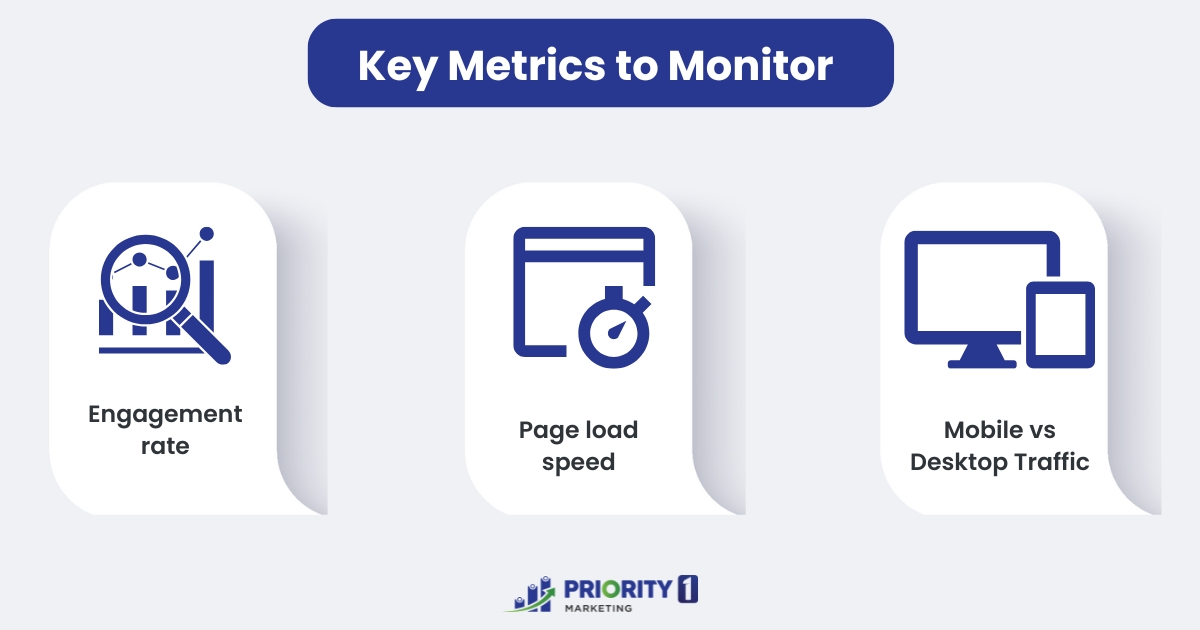
Key Metrics to Monitor
Monitor the following key metrics:
Engagement rate: the interaction between users and your website, such as clicks, scroll depth and features like video or forms. High engagement rates meant that users find your website engaging and do no find difficulty navigating on multiple devices.
A well-prepared responsive web design will boost engagement by ensuring an easy experience on multiple devices.
Page load speed is one of the most important factors, as an extremely slow page may scare users away, especially when accessed from mobile devices, as users expect fast access. Loading speed helps assess performance and becomes better when optimised. Tools like Google PageSpeed Insights help measure load times and pinpoint where improvements are needed.
Mobile vs Desktop Traffic: This metric indicates you a break-up of visitors coming from both devices. Mobile responsiveness is as essential now since there are a huge number of people using their mobile phones to access the websites more than ever. You need to make sure all features, layouts, and images are being adjusted responsively for any screen size. Analytics can help you determine problems in mobile usage.
Priority1 Marketing – Designing Your Web Presence Perfectly
Priority 1 Marketing is one of the most successful website design agency in Australia. The company mainly specialises in responsive websites, which provide great user experience at any time on whatever device. Well-versed with mobile-first design, we enable small businesses to compete even in dominated mobile space. Our plan is visually beautiful, cohesive, and fluid designs on smartphones, tablets, and desktops using the latest tools and technologies, including WordPress, Wix, and Webflow.
Focusing on responsive design, our agency boosts the engagement of users, in addition to web improvements, as it ensures smoothness in experience for visitors. Also, Priority1 provides SEO optimisation for several businesses wherein having a mobile-friendly layout and high-speed load ensure a higher rank in search engines and better online visibility with more organic traffic by businesses.
There is niche-specific solution, like tailoring a flexible CMS with which Priority1 streamlines the process of website maintenance and updating for the owner of small business. Website creation for local or international markets, what set Priority1 Marketing apart: their expertise, commitment to their clients’ success, and their ability to provide a website that is phenomenal not just in look but functionality so that it maximises growth over time online.
Conclusion
Web presence is no longer a privilege but a must in this modern digital era with the advent of responsiveness in design. Whether you’re running a small business or upsizing the company, you are targeting specific niches of the end-users who might require distinct services or products, so the responsive web design brings into your website a combination of user experience and engagement while simultaneously optimising your SEO. Keeping the eyes on responsiveness, making firms in Australia appealing to as many customers as possible will come to their webpage, work on high engagement on their websites, and win in the digital competitive market for the next coming years. Indeed, while working with a great website design agency like Priority1 using the right tool, such as WordPress, Wix, Webflow or Duda, making possible to create a stunning responsive website very possible and extremely satisfying.
